Service Design · IFS R&D International

Helping dispatchers optimize field operations by combining location intelligence with workforce scheduling in a single experience

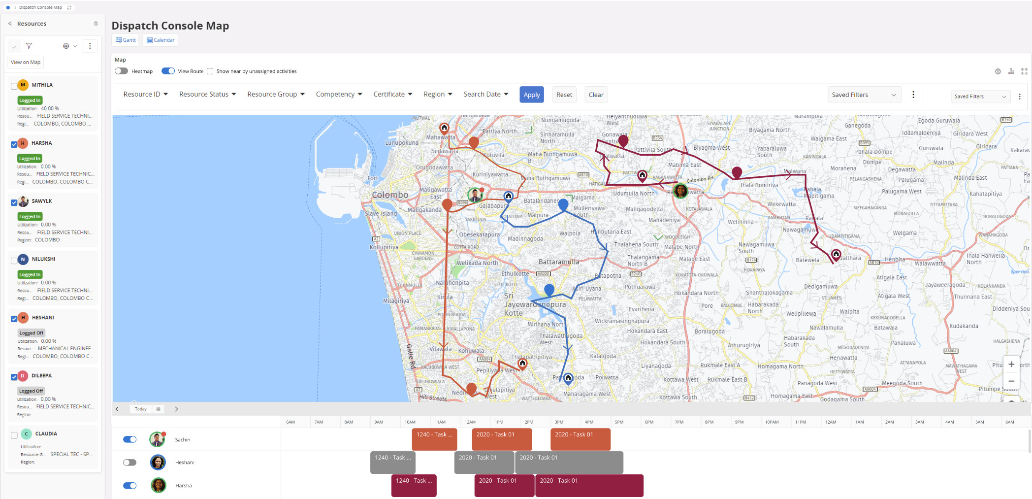
Dispatch Console Map View

Role
Lead UX / Interaction Designer
Duration
Ongoing from 2019
Accessibility
15-colour palette solving colour-blindness for ~60% of affected users
Methods
Interviews · SWOT Analysis · Storyboarding · Wireframing · Usability Testing

Ending the two-tab workaround

In the legacy product, dispatchers juggled two separate tools — an internal Gantt chart and an external map — to answer a single question: who is the best person to assign to this job? The context-switching was slow, error-prone, and frustrating.

The Dispatch Console Map unified both into a single interface. Dispatchers could now see real-time technician locations, visualise work routes, check appointment status, and identify nearby unassigned tasks — all without leaving the screen.
Dispatch Console Map View

Lead end-to-end process

I was responsible for establishing the UX process and driving all design activities for the initiative — from early discovery through to prototype validation and developer handoff.

Process
Defined and introduced a Design Thinking process within the product team
Facilitated discovery and problem-framing workshops
Research
Conducted user research and stakeholder interviews
Created personas, journey maps, user flows, and story maps
Design
Led ideation and concept exploration
Designed wireframes and interactive prototypes
Facilitated usability testing sessions
Delivery
Collaborated closely with Product Managers and Engineering
Iterated designs based on feedback and technical considerations

The Challenge

Dispatchers were working blind — toggling between tools to answer one question

To assign the right technician to a job, dispatchers needed to know where each person was, how busy they already were, and whether any nearby work could be grouped efficiently. None of that was visible in one place.

The legacy workflow included a small, integrated map within the Dispatch Console — but its limited functionality made it difficult to understand technician routes clearly, leaving dispatchers without the spatial context they needed to make confident decisions.

Key Questions
? How might we provide a user-friendly visualisation of technician locations and show the work routes of field service agents?
? How can dispatchers identify nearby unassigned tasks without switching out of their scheduling context?
? How do we surface route and location data in a way that supports fast, confident assignment decisions?
? How can we design for accessibility — particularly for colour-blind users — when colour is the primary differentiator on the map?

Understanding the problem

Rather than jumping directly into solution design, we focused on building a thorough understanding of the problem space through focused research and analysis.
Specialist Interviews
Interviewed industry specialists to understand real dispatcher workflows, navigation pain points, and the limitations of the existing map experience.
Storyboard Walkthroughs
Research findings were visualised as storyboards and walked through with the team to build shared understanding and align on the core dispatching scenarios to design for.
Pain Point Synthesis
10+ dispatcher pain points were surfaced and clustered — covering route visibility, direction of travel, colour accessibility, and the inability to identify nearby unassigned tasks.
Competitive Analysis
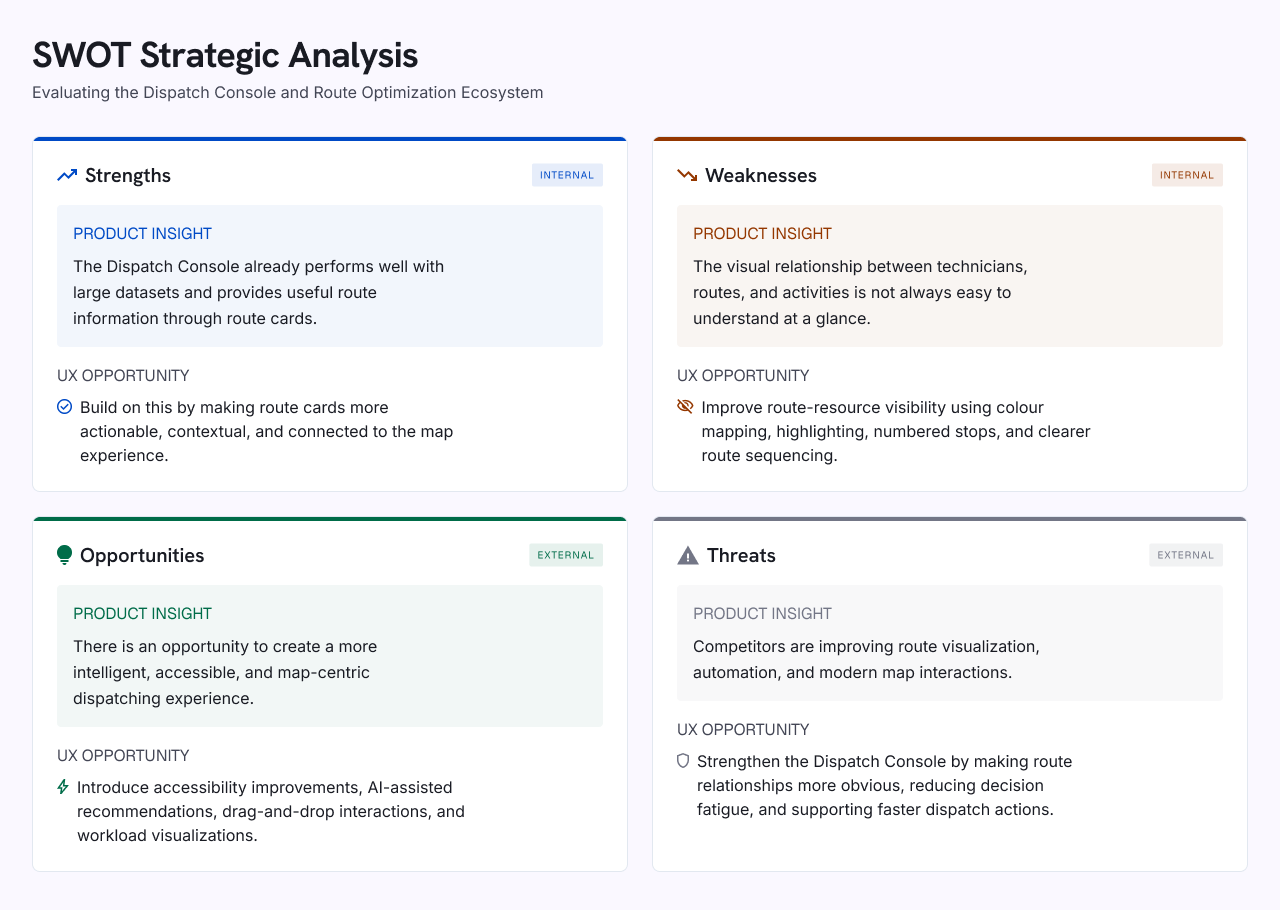
A structured SWOT analysis across three major competing products identified market strengths, gaps, and opportunities for our solution to differentiate.
SWOT Strategic Analysis — Dispatch Console and Route Optimization Ecosystem

Identified pain points

Specialist interviews and storyboard walkthroughs surfaced nine recurring pain points, all centred around visibility, route clarity, and the inability to make confident dispatch decisions from a single view.

How to identify resources travelling to the same customer on the same day?
How to identify unallocated tasks near a route and check resource availability alongside them?
How to surface uncertainty or exceptions in a technician's shift?
How to identify which routes have capacity to absorb nearby unallocated tasks?
How to compare resource availability and assign nearby tasks efficiently?
How to identify a resource's start and end location when multiple routes are visualised simultaneously?
How to communicate the direction of travel and work execution order on a route?
How to support colour-blind users when multiple technician routes are displayed on the map?
How to identify all work assignments relevant to a specific technician at a glance?

Mapping the dispatcher's journey end-to-end

A user flow was created to trace the full dispatching sequence — from loading resources on the map, filtering and toggling routes, through to identifying nearby unassigned activities and making an assignment. This helped the team align on key decision points and interactions before moving into wireframing.
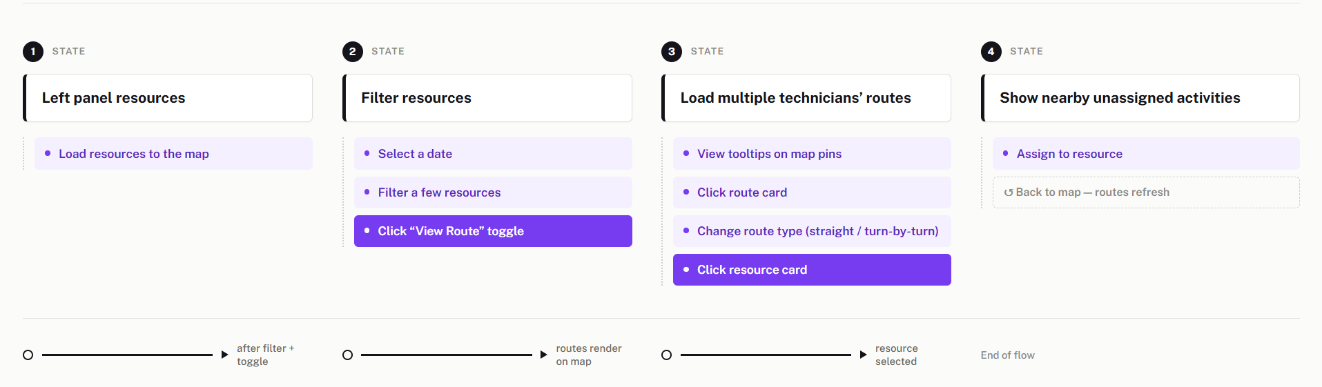
User flow — Multiple Routes, Dispatch Console Map

User flow — viewing routes of multiple technicians in the Map view


Designing for colour-blind users from the start

When multiple technician routes are displayed simultaneously, colour is the primary differentiator. This created an immediate accessibility problem that needed to be built into the design system — not retrofitted.

Accessibility Decision

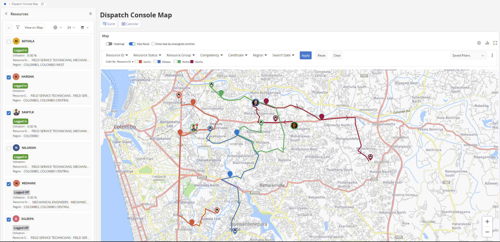
Designed a palette of 15 route colours at varying contrast levels, solving colour-blindness differentiation for up to 60% of colour-blind users. All prototypes were tested with colour-blindness simulation plugins in Figma before handoff.

Additional accessibility improvements
  • Changed start and end location pins to make route direction and technician differentiation immediately clear
  • Introduced tooltips and information cards on routes and pins as visual cues for users with visual impairments
  • Validated all changes against colour-blindness simulation plugins covering deuteranopia, protanopia, and tritanopia

Validated, refined, shipped

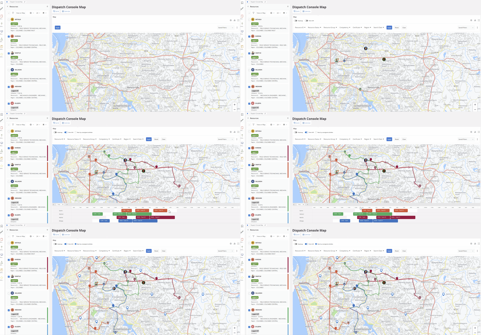
The final prototype incorporated usability test findings with targeted improvements. The solution gave dispatchers a clear, accessible view of all technician routes — with enough information to make confident assignment decisions without switching contexts.
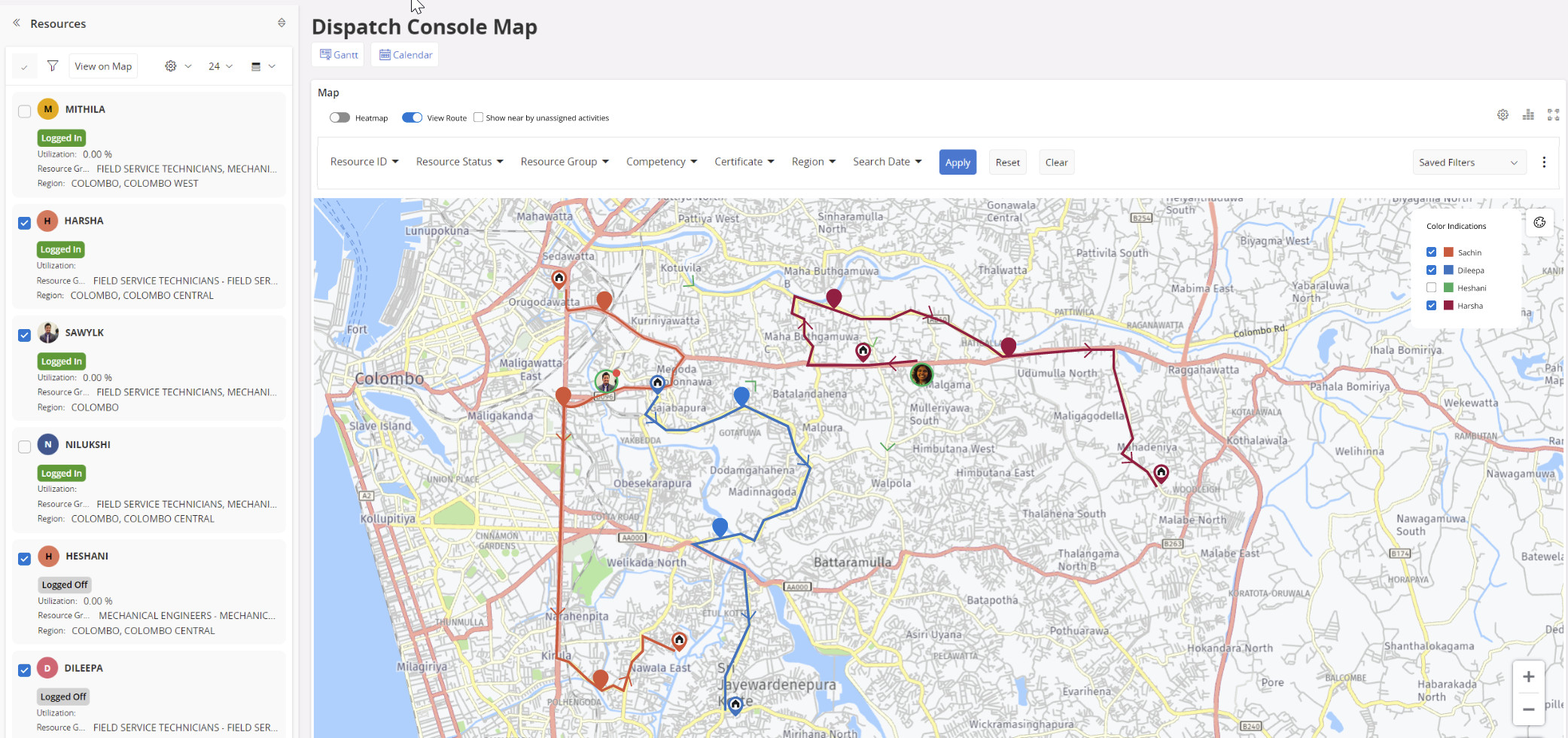
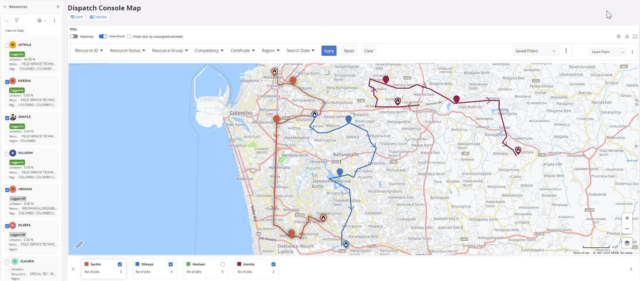
Iteration 01
Prototype iteration 01
Iteration 02
Prototype iteration 02
Iteration 03
Prototype iteration 03
Iteration 04
Prototype iteration 04
Interactive Prototype
Interactive prototype — Dispatch Console Map